
Visual Solutions for a McDonald’s Open Brief, Ba-dah-ba-ba-bah

McDonald’s was a dream client for an aspiring copywriter like myself in 2010.
Everything about McDonald’s is legendary: the iconic red and yellow colors, the nickname “McD’s”, and their classic characters.
When I received the McDonald’s ad brief, it felt like winning a golden ticket.
However, my partner and I knew we needed to deliver the goods for one of the agency’s top clients. The first step was to present our concepts to two seasoned Creative Directors who’d already done impressive work for the brand. They certainly didn’t want to disappoint, and neither did we.
What’s the product? I asked.
Doesn’t matter.
Doesn’t matter?!? Did I hear that right? Did I receive an open brief for McDonald’s?
Yes, I did. I did receive an open brief for the Golden Arches.
Our deliverable was out-of-home billboards for college sports sponsorships, but the product was our choosing.
My art director and I hit the conceptual stage hard. We knew their iconic French fries were an irresistible sell with low baggage. I also remembered how fun it was to grab a fry snack after a sporting event or practice as a kid.
We didn’t rush off to our computers, or even use photography to get started. Even though we had all of that at our fingertips in the Leo Burnett building.
Instead, we began the process with hand-drawn sketches—a traditional way of concepting called Marker Comping, a hand-drawn Sharpie sketch inside of a simple border.
In fact, one of my first advertising student assignments was to draw one hundred marker comps in one week for one product. It can be incredibly time-consuming if you go into too much detail in each drawing. This exercise teaches quick sketching and to keep moving through concepts.
It also helps physically connect your hands to the project. There’s something about clicking on a mouse and a screen that can cloud out simple ideas and miss out on concepts. Even for writers.
Marker comps also give creative directors and other stakeholders the opportunity to get involved early. This keeps projects focused, and it prevents wasting time on unfeasible ideas.
The point is that attention too much design or attention to detail can be the enemy of early concepting. That effort can be saved when strategic ideas have found alignment.
For example, we presented nearly thirty marker comps when we landed on this Visual Solution for McDonald’s. Once we had our campaign, we went back and added all of the crucial details that helped make it great. Those details included getting the ball's dimples and the stitching done correctly, but it’s hard to tell in this computer version.
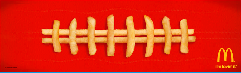
These visual solutions have received the most compliments from other creatives in the field. You can find these types of executions often shared online, which shows their ability to be timeless. My Creative Directors affectionately referred to Visual Solutions as “stuff made of stuff”, and that always stuck with me as very funny.

We handed out these D-Fence boards to the Valparaiso University student section. They went wild!
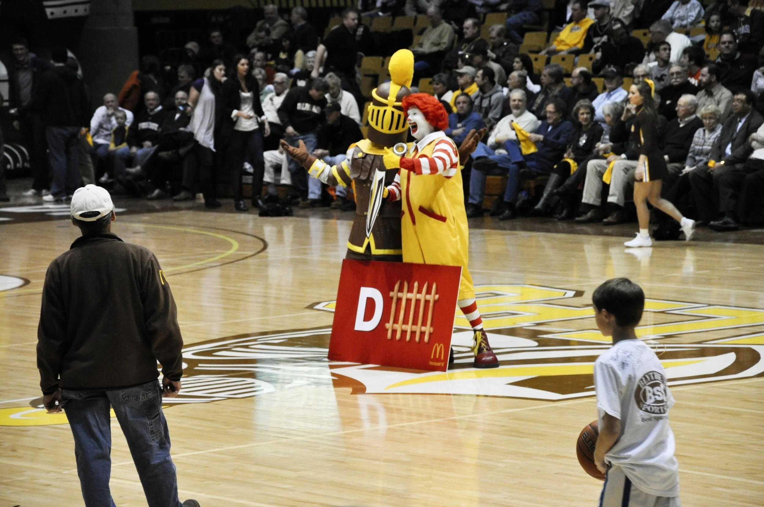
I got to attend an NCAA tournament game when this work launched. It was such a fun experience; the student section went wild, and we had a blast cheering on the team. We also got great photos thanks to my wonderful Art Director/Designer, Matt Feloni.
The experience was a pinch-me-to-make-sure-I’m-not-dreaming moment. Advertising occasionally does that. I loved the feeling of seeing everything unite together—the passion of our team, our client, and the Valparaiso basketball fans.
My final thought: Clients, challenge your creative teams with an open brief once a year.
Maybe it’s just one small media buy. Or a thirty-second radio ad. But your creatives need to spread their wings and fly. And at the very least, you’ll get an entertaining presentation made with that one magic ingredient: love.
Bah-da-da-da-dah…I’m lovin’ it. (Sorry, couldn’t help myself)
Check out my thoughts on visual solutions here:
The One Advertising Idea That’s (Almost) Always Clever